Two fairly minor UI enhancements I’d like to see (minor in terms of impact/usability, I’m sure implementing is difficult):
Dockable sequencer window. That way, I can keep everything on one screen, albeit with a smaller image window. I know I can close the sequencer window (and I do this often).
Resizable sequencer window. Specifically the target list, when going after many targets, can be a bit small to navigate. Also, for events within the target: if adding more than 5 events (say, 6 or 7) I’d probably just prefer a larger (taller) sequencer window than scrolling, or potentially shorter if only 2 or 3 events.
Ah yes, I have! It is a valuable “mini-view” but for some reason I keep opening the sequencer. Maybe I need to retrain myself, as I realize much of the data in the sequencer generally doesn’t need to be viewable, like connected equipment, file/folder paths, etc.!
Wait, you can’t read my mind? In my head I was thinking I’m often switching between the image window and sequence window. My thought was to make the image window resizable within the “desk space” but also put the sequencer there so they sit side by side or above/below, so not much of a layout change but just everything dockable.
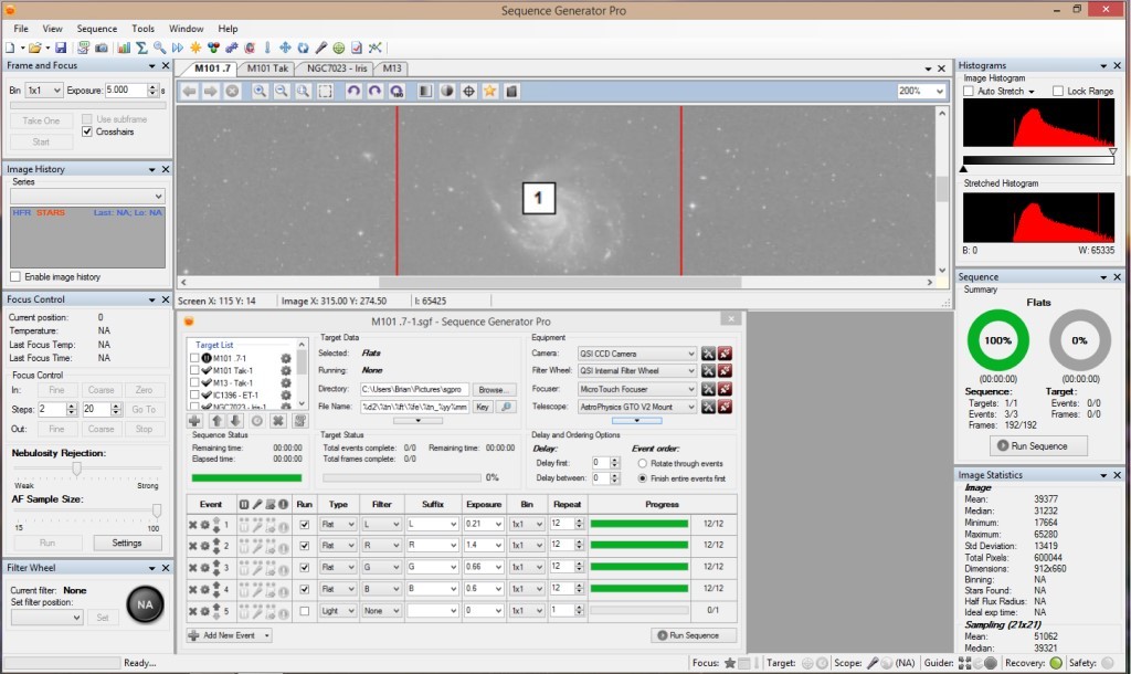
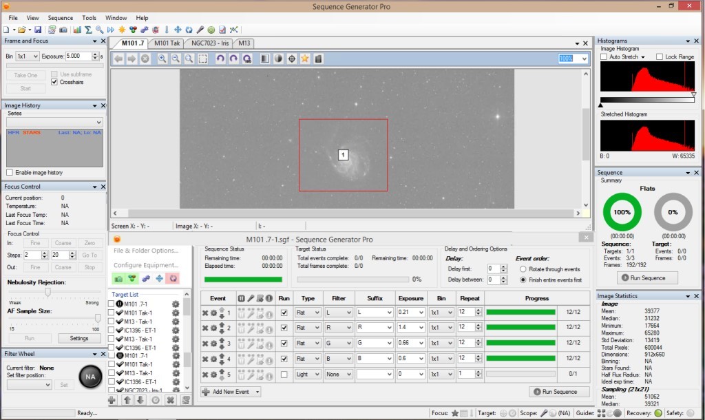
Sequencer widened and shortened. The target data group box collapsed into a button, but putting it under Target Settings I think is better. The equipment list simplified to show what’s connected / needed to be connected.
@Bhwolf I like the bottom one a lot. I too spend a lot of time opening/closing the sequence dialog. The widened/shortened version provides direct access to the most operational items, and suppresses the ones you are not going to change after the sequence starts. Docking it would mostly eliminate my need to be closing/opening it repetitively.
I’m not exactly sure what this will be, but I am adding it 2.5.X for consideration. When we get closer to implementation we will post some ideas for feedback. The idea is to move toward efficiency, but also toward simplicity. If efficiency comes at the cost of confusion (for all but our power users), we probably won’t do it.