Fantastic Ken . . . got to keep a sense of humour ![]() !
!
I like the refreshed look & importantly you and Jared keep up the good work ![]() lots of thanks from me!
lots of thanks from me!
Fantastic Ken . . . got to keep a sense of humour ![]() !
!
I like the refreshed look & importantly you and Jared keep up the good work ![]() lots of thanks from me!
lots of thanks from me!
Thanks @entilza for the feedback.
Thanks @BarryWilson
Oh!, Also, I forgot to mention… if you didn’t already know, you can hover over almost any icon in SGPro and a tooltip will pop up revealing the icon’s purpose. Not the most fluid workflow, but it would probably take you only a few times before you made the association.
Strictly about the colour scheme… not liking the orange. Doesn’t look very good/pro, IMO. The active and inactive states don’t appear as obvious with the orange. Red/green was good, on/off, easy quick visual… The overall GUI needs to be a dark grey with contrasty icons and text, just not orange! Would be easier on the eyes. I agree with the “Halloween” comment. The technical side of SGP is though, as always, quite extraordinary.
Cheers,
Hey @Ken,
You’re definitely not condescending. I don’t have an issue with the new icons/colours. Of course, my wife says I’m colour blind (not in the medical sense lol ! ). But I digress …
Most importantly … I fully and completely vote for NEW COOL stuff 
Keep up the great work (and @Jared too).
Dave NL
Ken, I will be honest. I’m not a huge fan of the new icons. A like orange and grey as much as the next person but from a purely ergonomic standpoint, on a laptop, I find some too indistinct.
Part of this is a visual contrast thing and others are the images themselves. Restricting the color range puts more emphasis on the design clarity for the user to discriminate between them. By selectively introducing other colors, it helps to distinguish small icons. On the basis of ‘if it ain’t broke, don’t fix it’, what were you trying to redress?
It is by no means a deal breaker - it does not compare to the win98 icons of MDL or the confusing tiny monochrome icons of Redshift, but you did ask.
I understand most of the points of view with regard to color and would agree that those complaints centered on the idea that “I don’t like orange” (including mine, since I am not an orange fan) are kinda silly. It is function that counts, not esthetics.
Having said that, and speaking as someone with a degree in perceptual psychology (undergrad before I went on to other postgrad things), two things are the most critical to visual perception, motion and color. Since motion is (mostly) not relevant, that leaves us with color. That is why I would plea for more varied colors, regardless of what they are. It helps us distinguish between items and therefore makes the interface better.
Just my .02
I didn’t ask, I said I wouldn’t stop you from complaining.
That’s a lot of science for what amounts to 15 buttons (some of which are arrows and rotation)
At the cost of other things I assume?[quote=“buzz, post:25, topic:4611”]
On the basis of ‘if it ain’t broke, don’t fix it’, what were you trying to redress?
[/quote]
Not important, but it had nothing to do with functionality or a burning desire to suddenly replace all the icons.
I am not sure the number of buttons is important and the science not that complex (has been well established for decades). Whether it is 2 or 20, when icons are different colors the eye/brain will distinguish more quickly and with less thought which makes for a smoother and easier user experience than when they are different shapes or even sizes. The smaller they are, the more true this becomes and with some of today’s high res. screens, they can get pretty small.
I am not much of a software guy (have done a little a few years back) but from what I do know, just changing colors is not a huge thing. What would take more time is developing a new and different logical and coherent coloring scheme. I basically think that going to all one color has had some negative human perceptual effects and has decreased what I would call the “visual ergonomics” of SGP.
As others have said, this “one color” thing is not a deal breaker but I would be remiss if I said that I thought it improved the program overall, I don’t think it does and IMHO is a step (albeit small) in the opposite direction.
These icons were held over from when SGP was free. The old icons do not permit us to use them for a commercial product. We were not asked to change them, but took it as a matter of ethics to operate within their license. Essentially we were self auditing and found we needed to fix this. So it was broke…But not from a user facing perspective.
Thanks
Jared
Changing color is fairly simplistic. Changing iconography is another story as they’re static image resources. Add to that neither of us are graphic designers so we’re at the mercy of icon packs that we can find that look decent and aren’t thousands of dollars for a commercial license.
People hear that you’re distributing them and the licensing cost goes up 100x.
Many folks assume that the cost to develop software is just our time and while that is a significant part there are other hard costs that come with licensing fees. Believe me if we didn’t have a reason for changing the icons they would have stayed. If their license allowed commercial use for a reasonable price they would have stayed.
If someone would like to design us an icon set that is better and more of a fit we can certainly talk licensing costs. But finding uniform iconography with astrophotography specific images isn’t a market that many artists are heavily involved in. It would be great if we possessed those talents but honestly I would rather work on better features than figure out how much drop shadow is necessarily on a 20x20 icon ![]()
Thanks
Jared
Thanks for this explanation Jared. That really helps us all understand the need for the change. And I think most of us would agree that cosmetic changes are not as important as functional improvements.
That said, what’s being said in this thread is not about the icons themselves but the color. We will all get used to new icons, no biggie. I think simply changing back to red/green for connected/disconnected, and keeping the new icons, will go a LONG way to ending this discussion.
Agreed. I have no issues with the icons, just the color. In fact, not even color but just the sameness of color.
Having said that, If were a graphics guy I would gladly design and donate icons. I wonder if there might be an SGP user that has those skills, I would bet there are.
What’s funny is that the new icons are MUCH easier for me to distinguish vs the old ones. I have a Red/Green deficiency (not red/green color blind. I can still see each color just fine and don’t wear crazy color clothes (at least not on account of not being able to distinguish them)). So when red and green are fairly dark or muted it becomes difficult for me to distinguish them apart when surrounded by other colors. For example I’m told there is a number between 1-9 in here…I can’t see it…

So I learned to know what the connected/disconnected image looked like and not the color and it wasn’t extremely distinct to me. Best I could tell the colors just looked a little “different” but not vastly so. As you can imagine this is super annoying when attempting to process narrowband data and I get to bug Ken and my wife a lot to know when the colors seem balanced…also why I hate processing.
Thanks,
Jared
Uh oh…there’s a number in that picture? 
I think it’s 9…but I’m not sure.
There’s supposed to be! Unless maybe it’s a control image? I dunno…I always fail these tests at my eye doctor…the optician always looks at me like “really? nothing?” “Yes…nothing, thanks for the shaming, please continue…”
Jared
The color is unfortunately, part of the icon. Being that it’s just the color you (others) disapprove of does not make it easier to change.
While we appreciate this, I think it puts us in an awkward position. If somebody is kind enough to offer their services and we accept, but don’t ultimately like them… well, it’s just easier not to tell a person doing free work that you don’t like it.
I don’t know if that will happen either frankly. Color means good… that should be enough. I don’t claim to be an artist, but having a major part of the UI as red / green and the rest the way it is, is jarring to me and as we are all coming to realize… making sure I’m satisfied is what is most important.
Also… I don’t think the image Jared posted has a number… I don’t think I’m color blind… this one has one though:
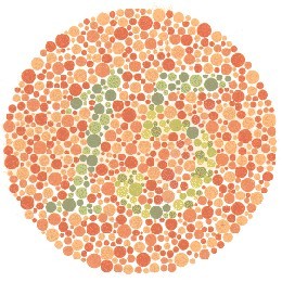
Disagree…although I think I can make out a 17 or a 15 if I fill in what is missing to me. But this is more of a pattern matching exercise vs “sight”. I can make out some spots and guess what it likely is…
Jared
Also you may want to ask your wives about the one I posted. Women typically have better color perception than men do. My wife (allegedly as I cannot actually verify…) saw a number fairly quickly in the one I posted.
Jared