I recall reading in these forums some time ago the author of GNS had increased the number of lines for the status message on your phone (currently seems to be 3 lines.
Does any using this system see the countdown for the current image? (how many seconds left to run). I find even with a short Sequence name the last info I get is “Frame x for 900s…”
Can SGP affect what info is sent?
Would it be asking too much to see all of the SGP status line displayed pretty please?
Otherwise find this addition to SGP valuable - imaging nights are few and far between, so nice to be able to check my rig doesn’t do its own thing and misbehave the moment I turn my back.
We don’t control this in either the Windows client or the mobile app. @jaime at Lunatico would have to make a change for this to happen. Unless you are asking that we shorten all of our status messages (which we are not likely to do).
I agree. I know it is the app, not SGP, but there seems to be a lot of unused screen real estate with the app that could be used to give more information. I tend to use it less as an error notifier (which tends to have a lot of false alarms anyway) and more of a monitor.
In fact, I would make an app done by the SGP guys another feature request. That way it would insure better display of more appropriate information. GNS is just barely OK, a native app would be much better! I would love to see something akin to what we now see in the “big status” window. In fact, if you could do nothing more than squirt that window to an app screen every minute or so that would make me very happy!
Hi, I have to check. The problem is the message from SGP is not fully displayed in the phone?
This may be solved already but not published - I sent a few beta apps some months ago and left the project until feedback happened.
I have plans to retake it later this year and add some other improvements, so it’s a great moment for any suggestion / request.
It’s fairly easy to modify the GNS software to support more status messages (such as a “main status message” and a “secondary one”, or 3, whatever…, and display them in different sizes, fonts…). The burden will fall on the application - SGPro in our case; I don’t really think it is worth the effort, but I’m open to suggestions.
Regarding the false positives, though: by design, the only false alarms the system can fire are due to communication problems - and you can configure both the number of tries before giving up and the length of the watchdog period. All other alarms are fired because some activity has exceeded its allotted time - and that time is specified (again, in this case) by SGPro.
In my experience as a user of both SGPro and GNS, Ken and Jared did a great job integrating the GNS into SGPro.
I’ll revisit the project in 6 weeks or so - ideas and bug reports from the beta most welcome!
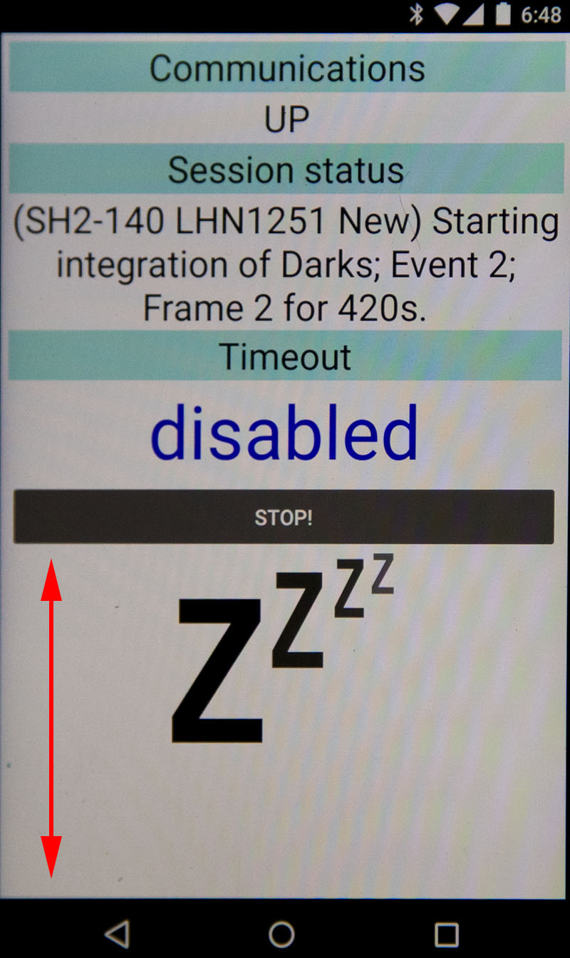
Here is a shot of my GNS screen during roof-closed darks this morning. This seems to be about the limit for characters, any more and it starts cutting things off. Given that many SGP users wind up with pretty long names, it is better to have as much room for text as possible. So this although this update is better, it is still not enough, IMHO. There does seem to be a lot a unused screen area (shown by red span arrow) available for more information display…
Just a quick question while you are here. Does a larger screen on one’s phone have any benefit or do you get the same amount of text on a larger phone, just larger? I would guess the latter.
I ask because I will be moving to a larger screen phone soon (waiting for Pixel XL).
With my lengthy filenames, the GNS is practically useless as I can never see what it is reporting… hope you can make use of the available screen real estate asap.
Going to post this here, plus e-mail directly, so I can include some screen shots of suggestions, but give other folks the benefit of the feedback so they can comment as needed too.
Tried out the APK, and some nice UI improvements. I installed the Windows app in the C:\Program Files (x86)\Sequence Generator\ but the installer doesn’t update the startup task with the new location. You could modify the MSI installer to handle that. I probably should have un-installed the non-beta app first, but if nothing else, you could add a note on your beta page indicating the suggestion to remove the app before installing the beta for SGP users.
Some points of feedback:
For the Windows app, you could indicate the app version on the main screen, or the configuration screen. Nothing fancy, just “v1.4” or something like that in the lower right corner of the screen. That’ll make it easier for your users to identify which app is running. You could also add that to the start of the log file as a message like “Initializing log file with Good Night System version 1.4”
Looks like the messages from SGP are better formatted in the GNS main window. I was seeing two-line messages \be clipped before. On 3 line messages, however, they are still getting clipped.
You have plenty of real estate if you wanted to size up the app vertically. I doubt anyone would mind if the app was 2x taller. For the benefit of not having text clipped, might be worth considering.
Over to the Android app. I think that one of the benefits of the app is that you can view it at a glance and have an idea of whether all is good, or you need to pay attention. The large fonts help that a lot.
The communications section seems to be telling me whether the Android app is communicating with the Windows App. As a user, I guess I want to know: All is good, Something might be about to go wrong, or No communication. So far, in watching the app during normal operation, I see it toggle between “Requesting” and “… response received.” To me- that’s means “all good”. Since the bar is purple that says “Communications” one suggestion would be to color code the bar according to the status. Green = Good, Yellow = Trying, Red = Failed/error. The specific messages that currently show up are not adding value when the status is green, so I’d also just remove them if the status is green. Or, you could represent those messages with two green arrows. One brightens up from dim green to bright green when the “Requesting” is sent, and the other brightens up when “response received.” When errors do occur, like “Failure 1”, just simply turn the bar yellow, and show a progression of yellow dots. The status “Trying to re-establish” could simply be the same Left/Right Arrows but in yellow. “Closed” = Red bar. Text can be “Unable to connect” That can also replace the “Cause of ending session” bar with “Too many connection tries”.
On to the Status section. Because this contains the detail coming from SGP, it’s the key bit of information that lets the user understand the imaging process status. It’s key information, in my opinion because if certain events are taking a while, I want to know, even if they don’t fail or timeout. The title of the bar could simply be “Status at hh:mm:ss”. That’ll cut out a few characters and simplify the text a bit without changing the meaning. You could expand out the amount of text shown in the window to ensure you have plenty of space for long messages.
Timeout section. I’m torn between whether this information, or the Status information is more important. I believe that the Timeout’s important because if we get to the end of the timeout value, then something has failed. So, until we’re dangerously close to 0, all is good, right? So, again, back to color - you could change the font size down a bit, and change the color to Green so long as the timeout value is > 10. From 10 to 1, it’s yellow, and 0 or any error condition, it’s red. “…paused…” is green because it’s not an error condition. IMO, this information could be moved down to the bottom left, and share space with the “Stop” button.
Lastly, I’ll say that I agree with the desire to have more detailed status show up on the app. In SGP itself, the Sequence docking module contains the key information that I’d want to see in the Status section of GNS. I don’t need the donut chart, just a simple table with the statistics would be sufficient. I realize this requires coordination between both companies - both to provide (SGP), and to consume (GNS) the information. But, we’re in the Feature Requests topic, so seems appropriate to put it out there.
Thanks for listening, and I’ll continue using the Beta and providing feedback as I test more conditions out and find them appropriate for feedback.